

Over time, I’ve created quite a few flags and emblems, some of which you all might enjoy. This post displays some of the more interesting ones.
A major reoccurring theme in my designs is my wish for more transnational peace/cooperation/unions. For example, this flag for an Oceanian Union:
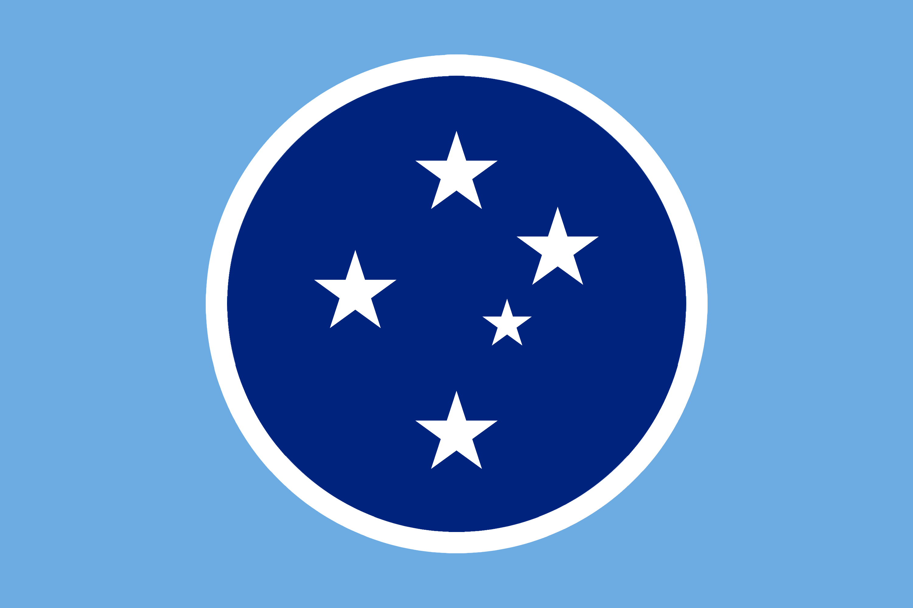
Inspired by previous proposals and other union flags like ASEAN, EU, African Union...
Dark blue, light blue and white are common colors in Oceanian flags, often representing the ocean itself, and the Southern Cross constellation is a common symbol in many Oceanian cultures and flags (since it was essential for pre-modern navigation).
Here’s an emblem for it:

And because I want my comment section to look atrocious, I also made a flag for an Indian-Subcontinent Union:
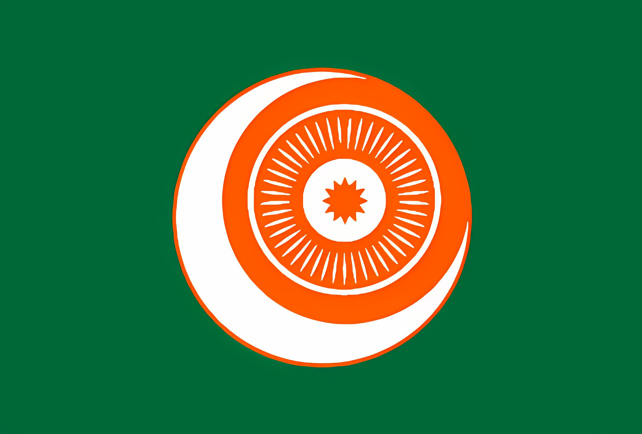
It’s a combination of the flags of India 🇮🇳, Pakistan 🇵🇰, Nepal 🇳🇵, and Bangladesh 🇧🇩, inspired by previous proposals. Here’s an emblem for it:

Continuing the trend of pissing of nationalists, here’s one for a United North America, combining the flags of Canada 🇨🇦, the US 🇺🇸, and Mexico 🇲🇽.

I riffed on this design by replacing the green star with the eight-pointed star of Mexico’s Bandera Trigarante, and the red star with a maple leaf-esque star.
And here’s the emblem:

Closer to home I made a flag for the Benelux: the union between Belgium 🇧🇪, the Netherlands 🇳🇱, and Luxembourg 🇱🇺. I took the average of the reds, the average of the blues and black, and then split the middle stripe in two:

Aaaand the emblem:

I also made a flag for a European Army, where the stars of the EU flag fuse together into a singular solid ring:
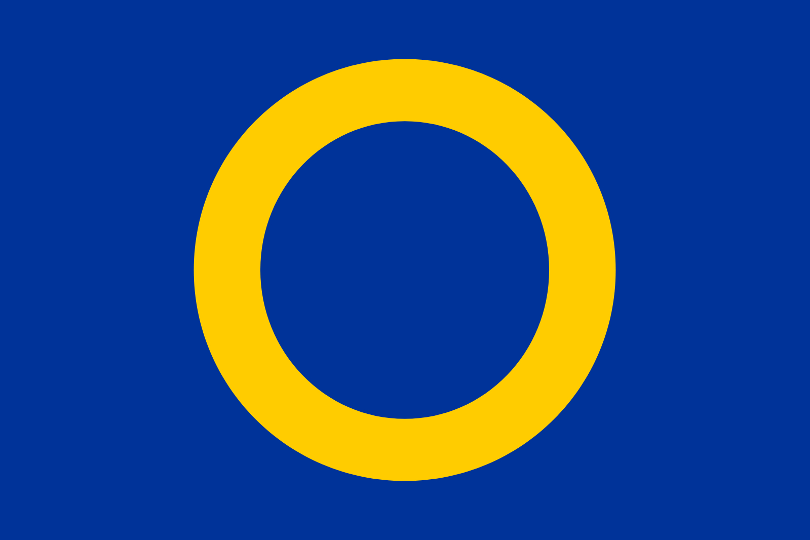
Its emblem could double as the air force’s roundel:
And while I’m dreaming, might as well make a flag for earth/humanity. I originally drew this design back in highschool by making an eye out of a strand of DNA and a “pale blue dot”. Someone had a similar idea, so to make the graphic version all I had to do was realign/clean up some things and change the colors.
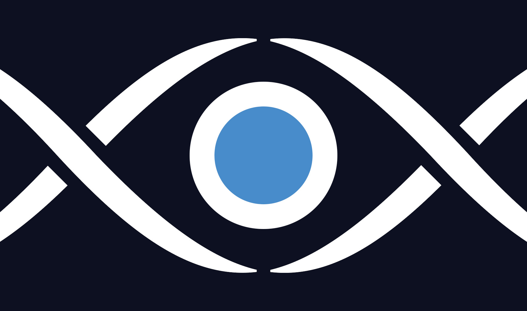
The white lines are strains of DNA which create a human eye.
The eye looks into the dark cosmos and thereby resembles planet Earth floating in space.
The DNA is white (peace, purity, etc), the blue is a shade of UN blue (unity, water of life, pale blue dot, etc), while the background is dark (the dark cosmos, the dark depths where life originated, etc).
Obligatory emblem:

So now we’re starting to stray into the realm of flags for concepts.
Longtime readers may remember that back when the name of this blog was ‘Reflective Altruism’ I had a different logo. Both name and logo were taken by much more prolific blogs, the former by David Thorstad and the latter by Bentham’s Bulldog — though both did also publicly communicate I was first after I messaged them about it (and both have written some great posts, so I’m happy it’s being put to good use).1
The story behind the creation of this flag is another microcosm of my relationship with the broader ‘Effective Altruism community’. There was an art prize on the EA forum for creating the best flag for utilitarianism. The following flag was my submission. It got the most upvotes, but the rules where changed after the fact, seemingly to exclude my submission (“no math symbols” was added, no one else had a math symbol). No justification was ever given, so I can only speculate.2
Despite the bad memories associated with it, it’s still one of my favorite designs:

The yellow stands for happiness, that which utilitarianism pursues
The white stands for morality, that which utilitarianism embodies
The symbol is a sigma, since utilitarians care about the sum of all utility
The symbol is also an hourglass, since utilitarians care about the (longterm) future consequences
The emblem could just be a round cutout, but that seems lazy, so I tried to invoke sunshine and happiness with a more exotic shape.

Let’s round this post off with a final concept flag.
“Woke” is the current popular pejorative for the left, but back in my day it was “Social Justice Warrior”. You could make a small fortune attacking their presentation while never addressing the substance (the more things change…). However, as much as I think that the substance is orders of magnitude more important (and that, by and large, these “critiques” were lazy and bad), I do actually care about the presentation too. And yeah, it could really be improved. In particular, the flag designs were/are getting out of hand. I’ve previously talked about disrespectability cascades, and what’s happening with the flags is a crystal clear example of one. Instead of letting something abstract (the spectrum of the rainbow) represent something abstract (the spectrum of human experiences), we’re in a race to the bottom to add a new color/symbol to the flag for every minority group, without considering the design as a whole.
So I took it upon myself to create a new flag for social justice (or “woke”, or whatever pejorative will be used next). It sadly never took off, but here it is anyway:
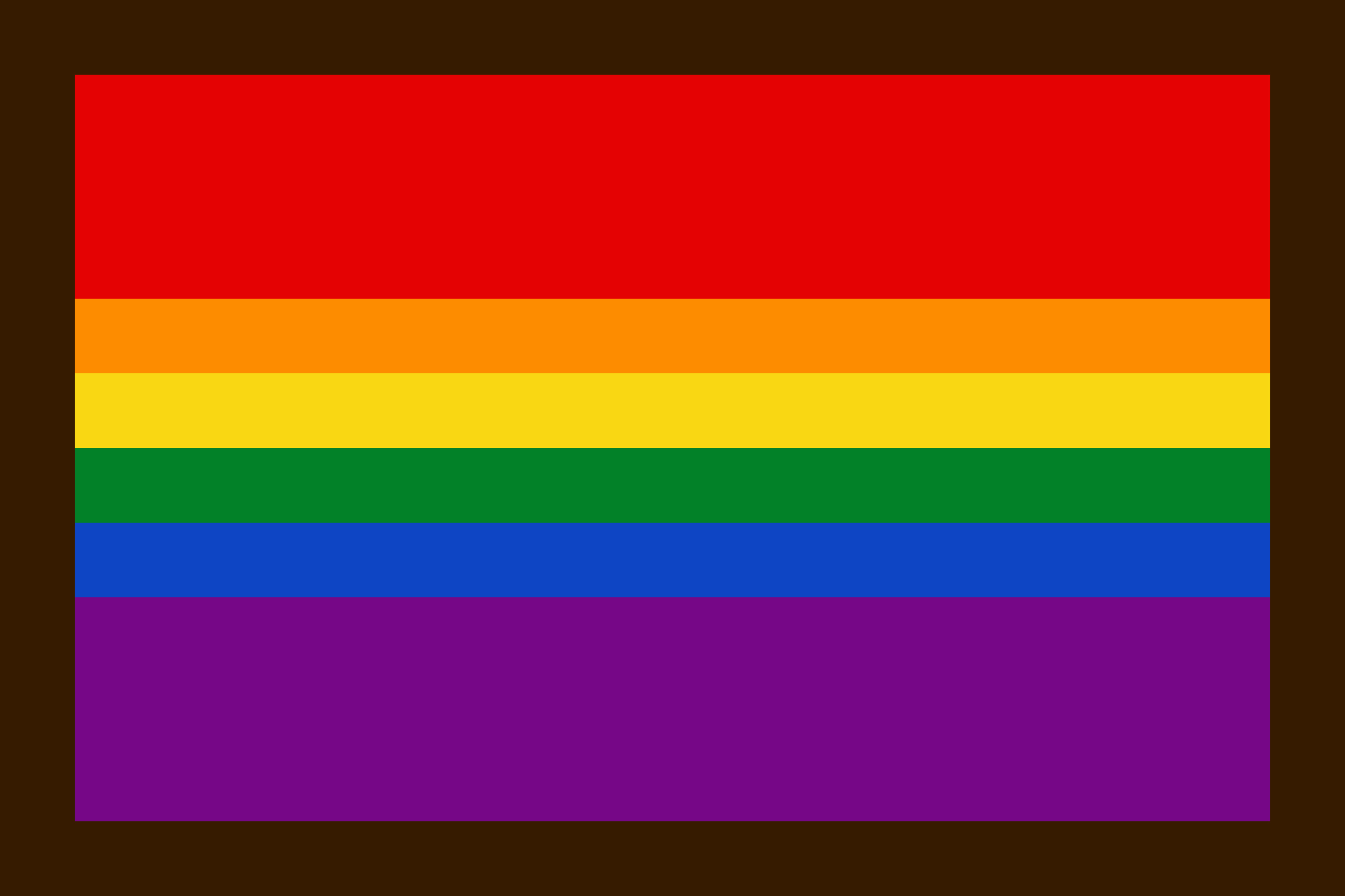
The fight for the queer community is represented by the rainbow, as usual, but the red and purple are stretched out to represent class struggle, and feminism, respectively. Which leaves us with the brown border for the fight against racism.
And here’s the final emblem:3

If any of you are in need of a logo or flag design, feel free to message me.4
I once came across some other EA blogger that used my current logo, so maybe I’ll have to change my design again in the future. Though I can’t find them again, so fingers-crossed they switched logos.
I suspect they just didn’t want to give it to me because of my outspoken heterodox/leftist stance on the forum.
EDIT: Originally I had a section here on how I reuploaded it on my EA profile, but that my EA profile got blocked. However, after uploading this post it has been unblocked, hooray! Presumably the admins have been made aware of this post.
Whether it was a bug or not, I’m still happy my profile is now available again. I will leave the original text here as matter of public record. The main body I will do first and then the footnotes. [begin section]
I later reuploaded it on my own profile, but that’s now blocked (the posts are still there, it’s just that no one can access my profile). Again, no reason was ever given, so I can once again only speculate.⁴ (Though, for the record, I think the EA-forum is generally much, much better than some other online EA/EA-adjacent spaces)⁵
[4] If you think I must have done something to deserve it, I encourage you to check out my writings. My profile is blocked, as mentioned, but you can still search my name and find my comments and posts. You’ll find that I never violated the forum’s rules, and in fact always took effort to cite my sources and stay polite, even during the most hostile of circumstances such as when I was being brigaded by “scientific racists” or when a high profile EA falsely implied I had doxxed people after I critiqued his project. I even went back and checked the sites discussion norms page, a page I contributed to, and found nothing that even slightly applied to me. Also, if there was a comment or post that violated it you would expect that to be taken down, but all of them are still accessible, only my profile isn’t.
[5] I fear that if I repeat some of the vitriol against leftists I’ve heard there, even substack would ban me.
[end section]
I lost some subscribers from this post, which may have been due to this section, though the section after is also likely. But if that was necessary to get my profile back, it was worth it. Again, a big thanks to whoever contacted the admins.
Sounds like a knockoff JRPG
All my previous graphic design work (for EA or otherwise) has been unpaid, so chances are that if your project is even slightly altruistic, I’ll do it for free.
You may live to regret creating the emblem of the Future Zizzians (Benthams Bulldogs)
I really like the Earth flag - it's better than most other versions I've seen, which are usually something very lazy like, "We just stuck a picture of the Earth on a flag."
Also, I didn't even realize Bentham's Bulldog's pfp was a more widely used symbol for utilitarianism - I thought it was just a logo he made for his blog until now. Another good design though. I particularly like the emblem version. It looks friendly, unlike the typical view of utilitarianism as "cold and calculating."